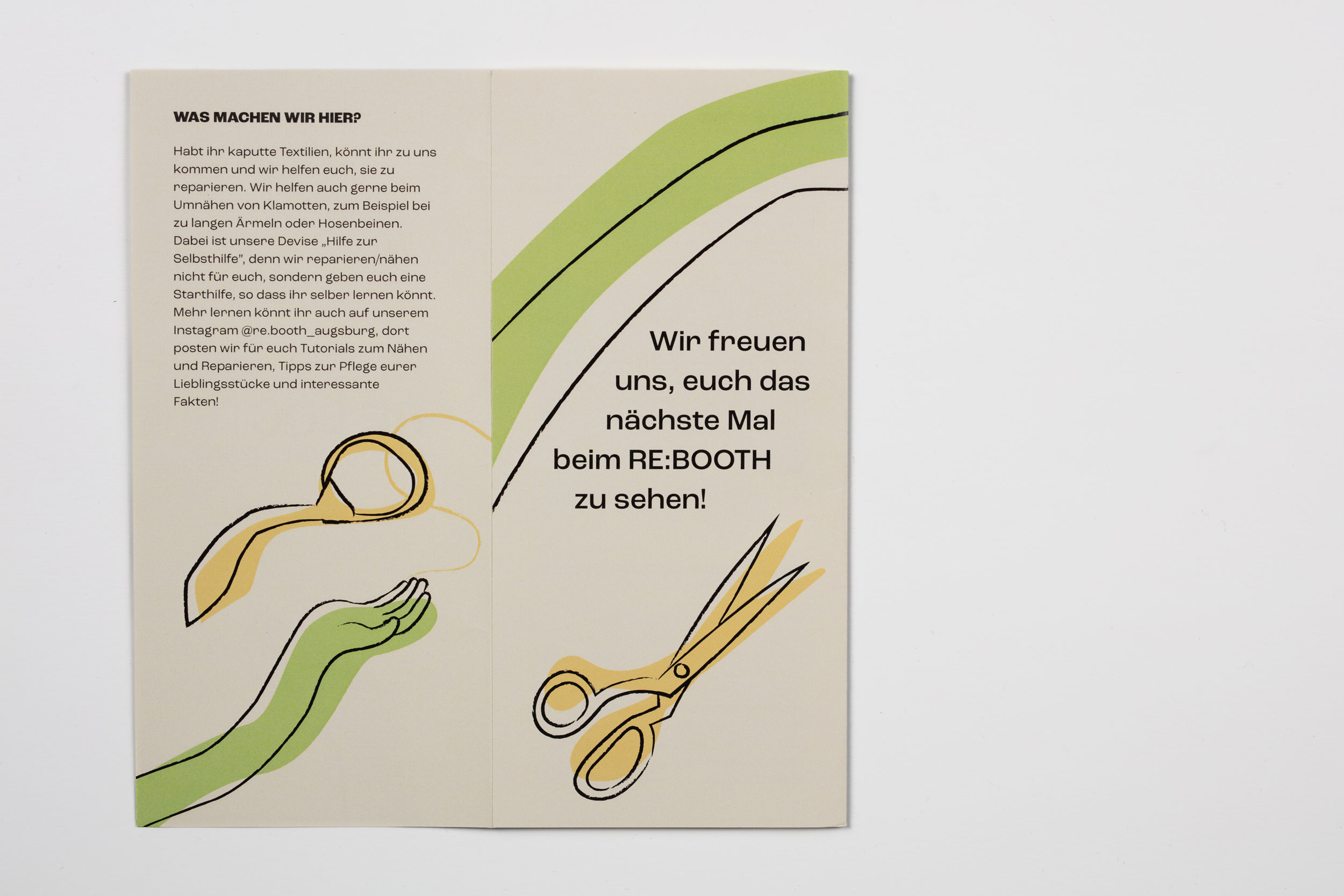
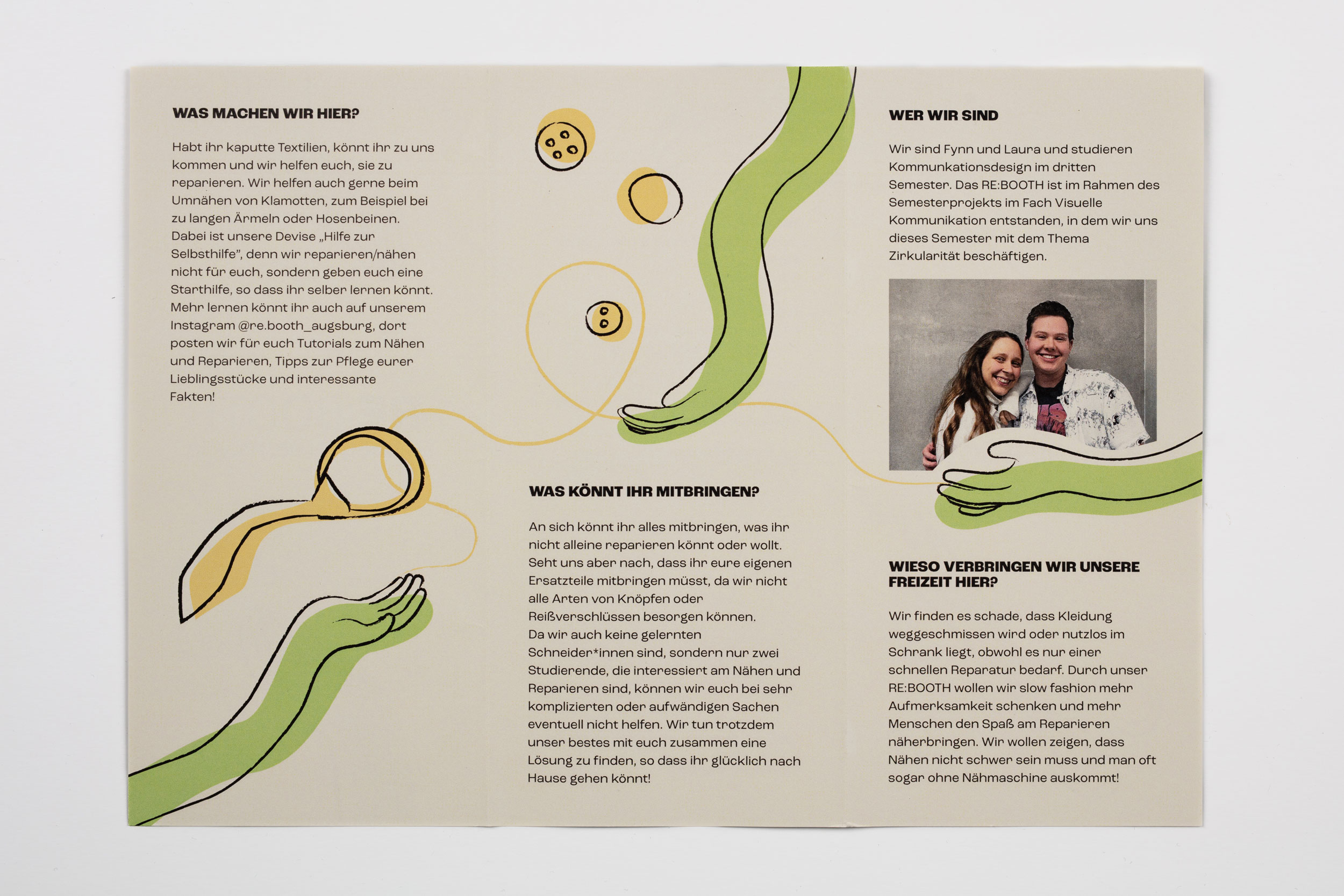
A combination of the words reboot and booth, RE:BOOTH is an imaginative initiative to repair, reuse and repurpose clothing to combat fashion waste and encourage circularity. The ‘booth’ – or in our case two small tables – stands in the entrance two times a month open to all students who need materials and/or help repairing their clothes. As initiators we organise the events and stay at the booth to help each other out.
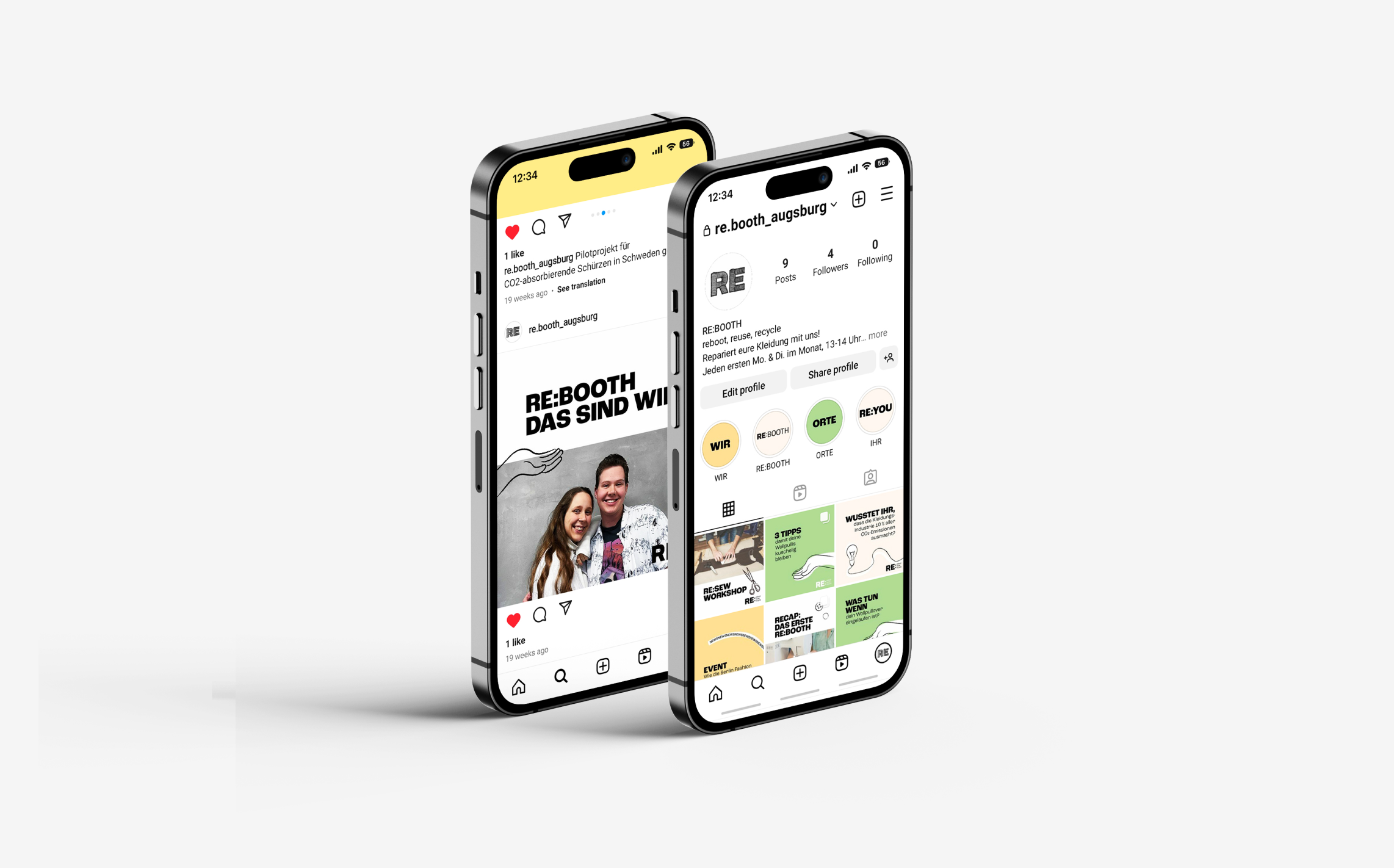
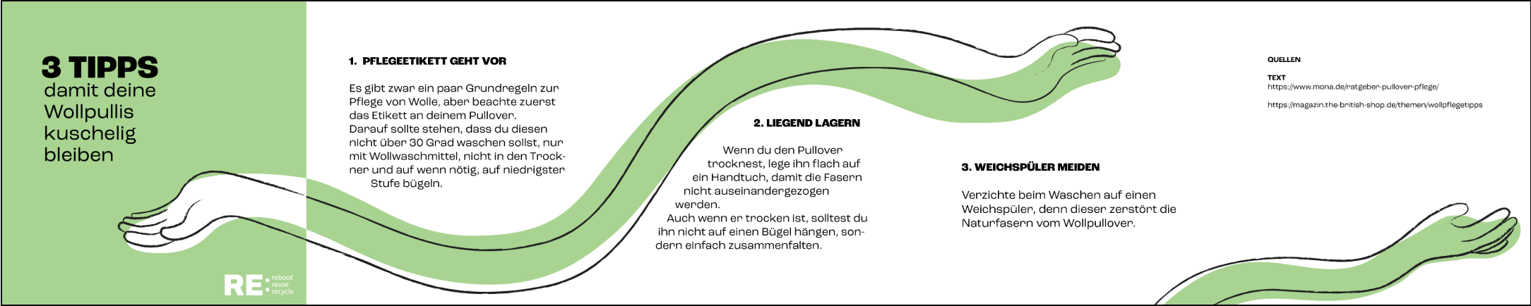
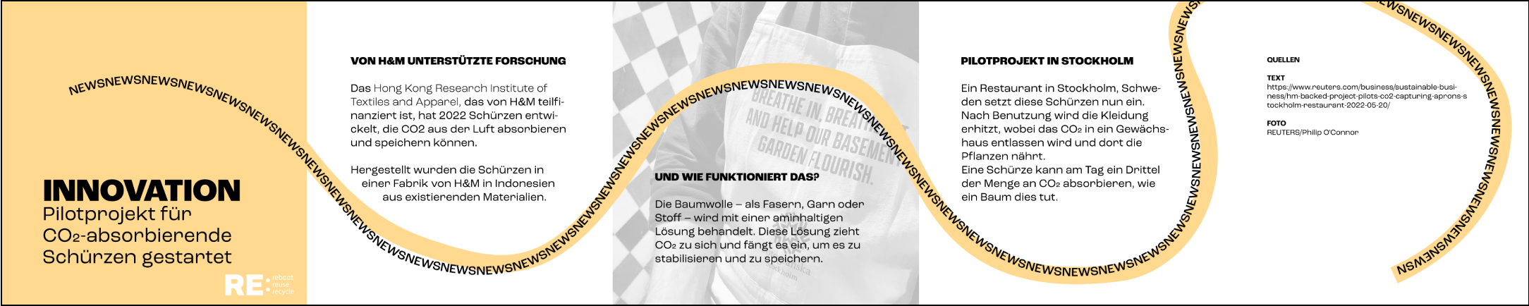
On our Instagram page we keep our followers updated about upcoming events and we post tips and tricks for more sustainable living. We also regularly collect interesting facts and relevant news for the page.
Design elements
The hands are an imoprtant recurring illustrative
element which symbolise the manual work,
sharing of knowledge and teamwork.
The other objects are mostly self-explanatory in
order to bring our concept across.
Because the prefix ‘RE’ means to do something
again and can give a new life to so many words —
which are also used in the slogan ‘reboot, reuse,
recycle’ — the illustrations reflect that versatility.
The Design
Our goal was to create a friendly, welcoming identity
which invites participation and engagement.
This is achieved by warm colors, playful illustrations
and a transparent appearance, contrasted
with a modern sans serif font.
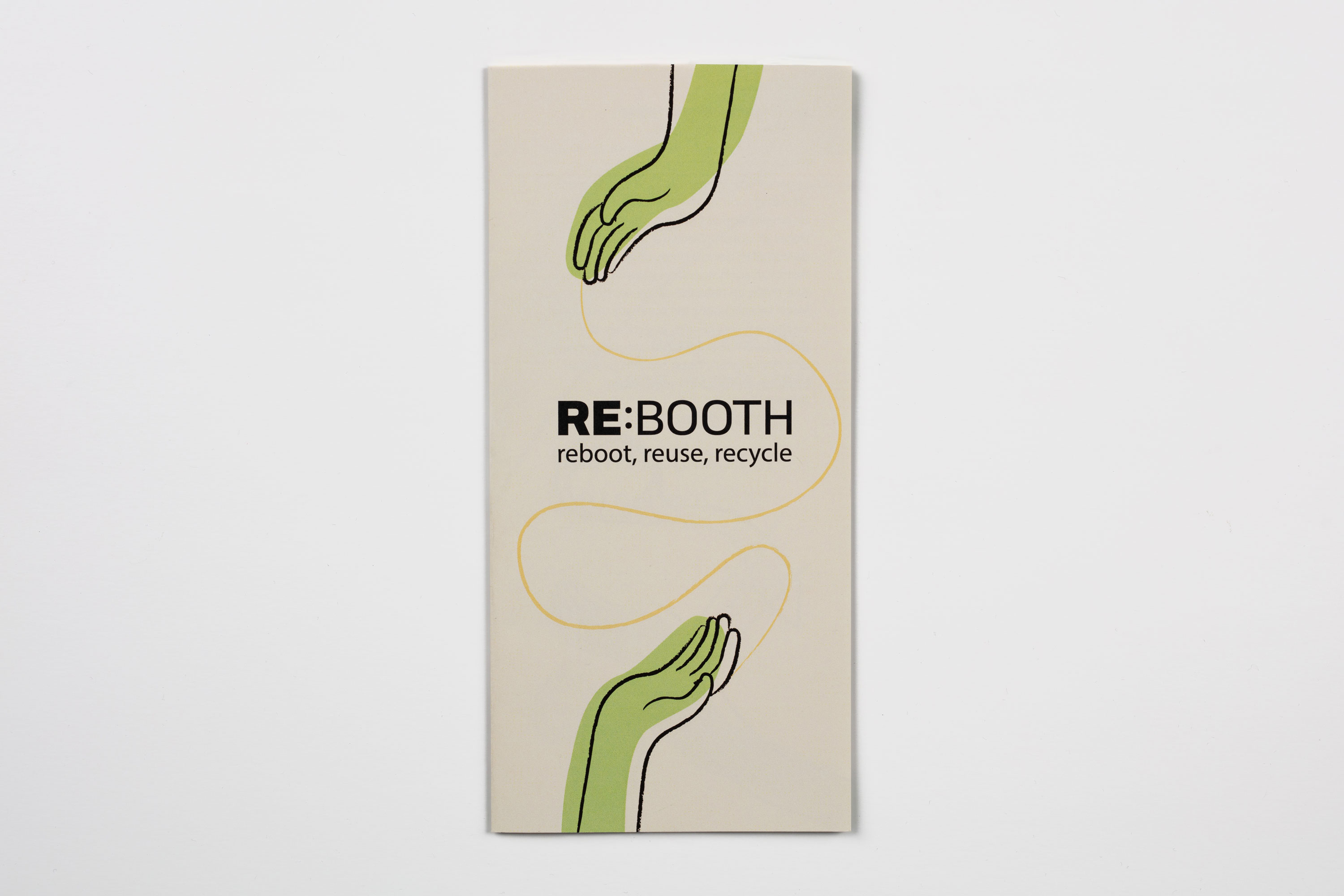
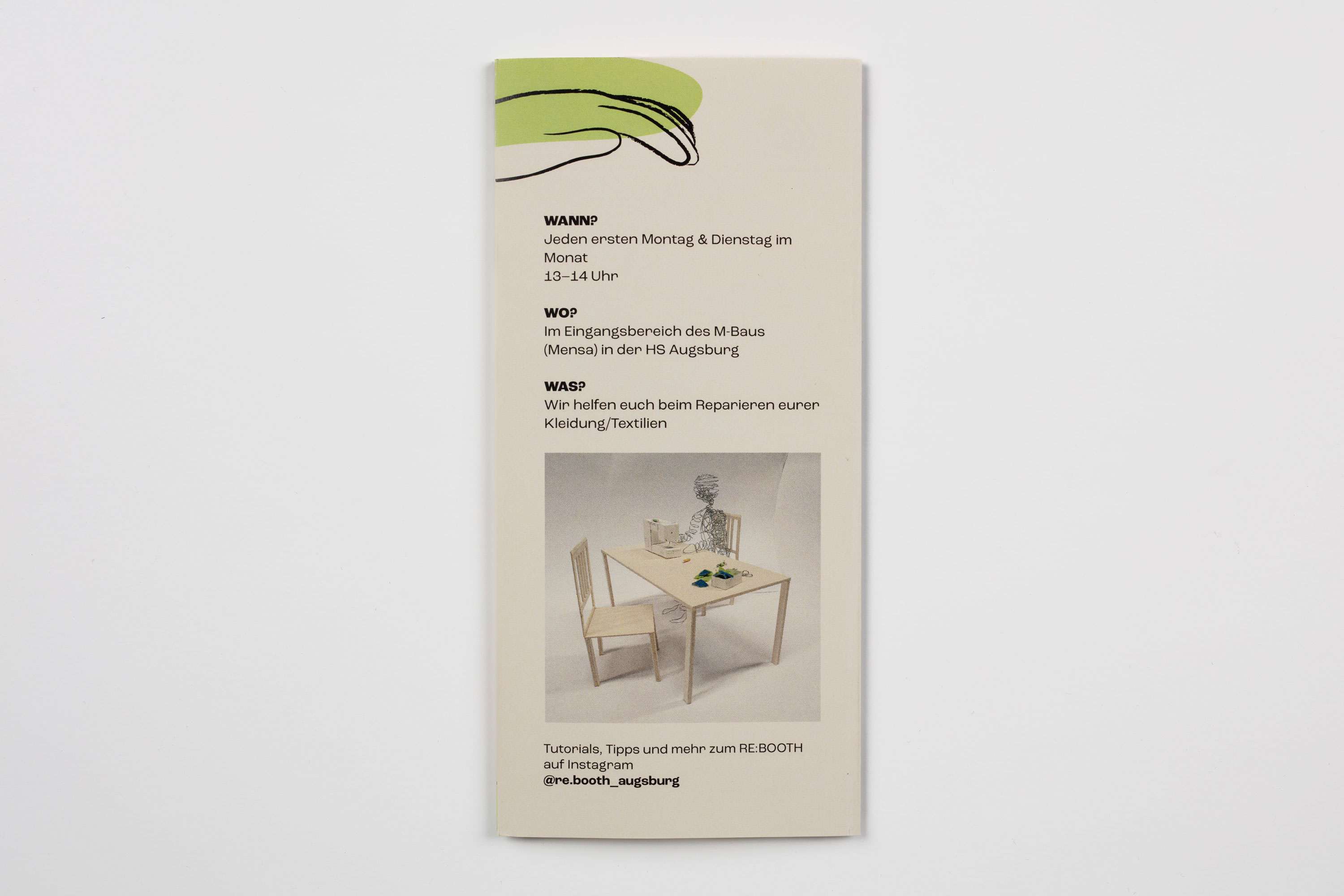
Print products
One of the print products were brochures, which
are distributed throughout the university to inform
students what, why, when and where the
RE:BOOTH takes place, completed with our established illustrative elements.
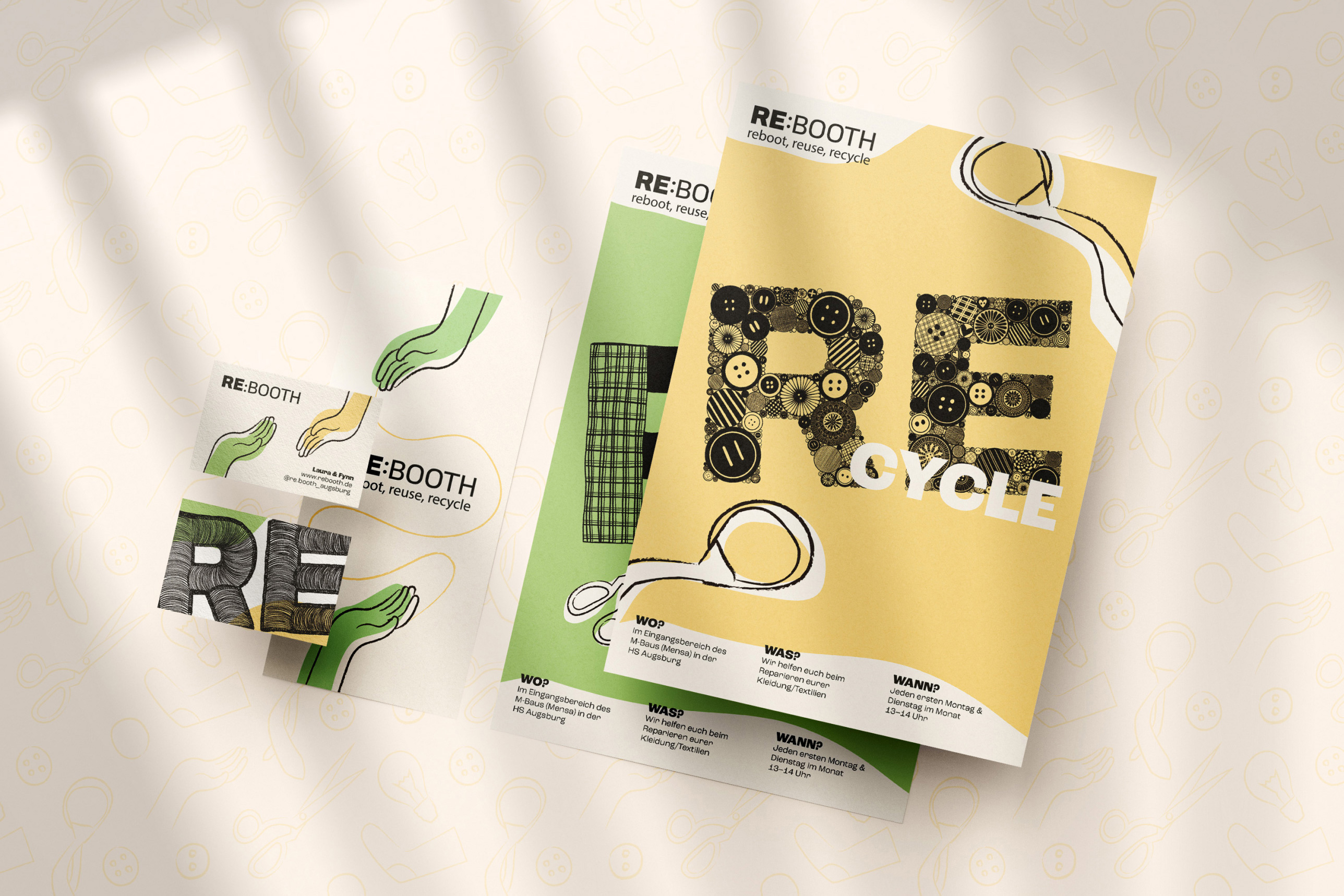
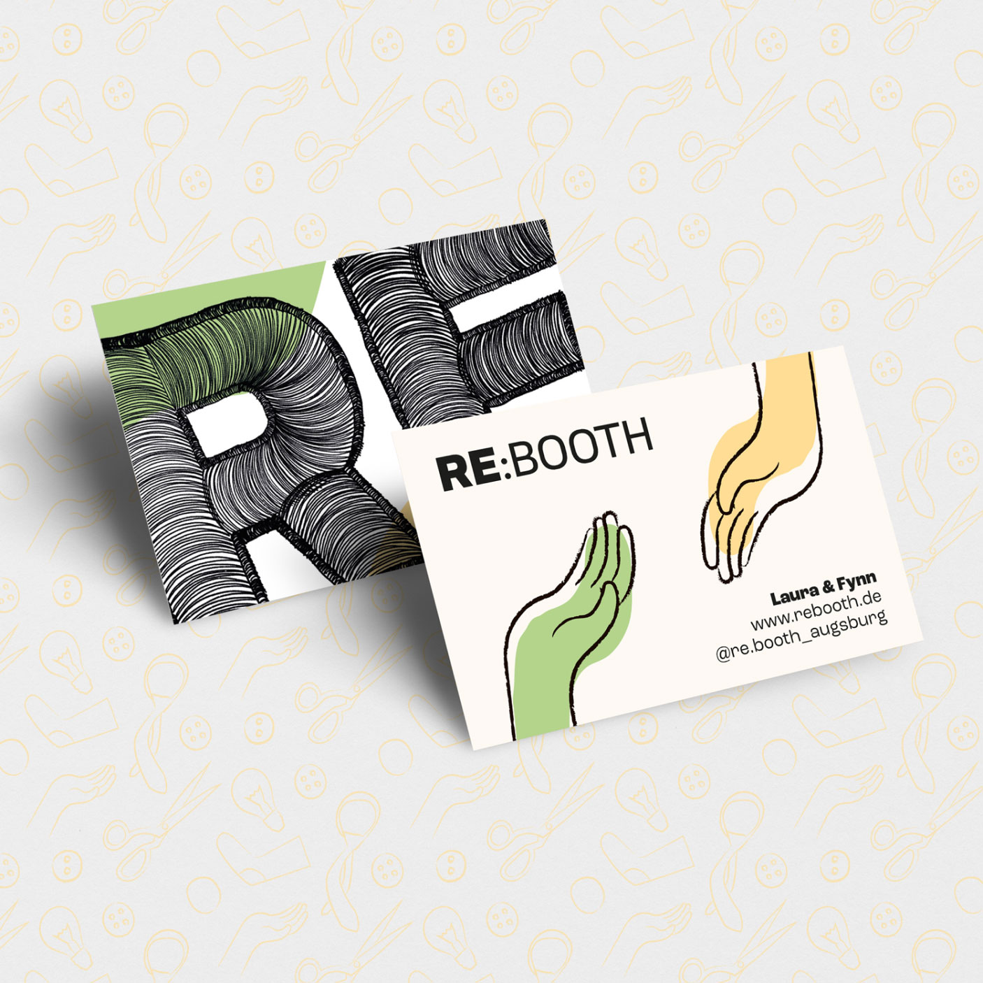
For advertising on the universities’ premises we designed posters which utilise the ‘RE’ of the logo as an illustrative element in different variations. This illustration can also be found on the business cards which students can pick up at the RE:BOOTH.